After watching a clip on modeling online yesterday, I realized how clothing designers act as an artist when crafting their intricate clothing patterns. Their different types of cloths act like different types of paint and they go through the same basic process when creating their masterpiece as would a painter. Expanding on the different types of art, clothing as an art brought on a new perspective of what traditional people would categorize as art. There are abstract clothing such as those with objects attached to them or with exaggerated designs on them. The picture in the middle resembles an art piece at the High Museum which was a chair made of many layers of clothes binded together. Just like in paintings, color plays an integral aspect and there are also cultural differences that can be found in the different types of clothing. Not only is it a form of expression but people can actually make use of the clothing and wear it as opposed to simply looking at it. I believe Plato would commend clothing as an art because it is not entirely useless like how he thought paintings were.
Tuesday, September 21, 2010
Tuesday, September 14, 2010
Fake Art
We discussed how a reproduction of an art piece has less meaning than the original art piece and I completely agree with that. Benjamin furthers this when he states, “even the most perfect reproduction of a work of art is lacking in one element: its presence in time and space, its unique existence at the place where it happens to be.” The original art piece has been altered from reproduction and does not have the same meaning because the context has also been altered. It is not THE artwork; it is simply the fake copy of it. It loses the idea that the painter touched it and the history and experiences it endured. It loses the journey the painted had and its conditions. In other words, it loses the “aura” due to reproduction. Just because you have a copy does not mean anything because everyone else has access to a copy just as easily. I think reproduction puts more value on the original because there is only one of the original and a million fakes. The reproduction makes you think that you are so close to the painting when really it makes you farther from it because the aura has been destroyed. Tuesday, September 7, 2010
YOU, ME, and the MIDDLE MAN
When artists create artworks they have a purpose in the details that they are creating. Bal and Bryson states that art is composed of signs that the artist has formed to be interpreted by art historians. They also state that there are 3 factors important to art historians when they do their work which include the sender, the context, and the receiver. The sender is the author (painter, sculptor, photographer, etc.), the context is the text that has signs in it which need to be interpreted, and the receiver is the audience such as the art historian. There is an important relationship between the three. Winston also agrees to these similar relationships. He states, "There is a constant exchange of emotion between us, between the three of us; the artist I need never meet, the painting in its own right, and me, the one who loves it and can no longer live independent of it." There is a connection between these 3 similar elements which communicate together to develop meaning of the art work viewed.

The author has commented on this piece and says that the theme of the series of photographs that this picture is part of is "mankind's complicated and vast relationship with nature." This is the view of the artist/sender. When I, the receiver, look at this photograph, the context, "Decorating Nature," I sense from the artist a creative and aesthetic style to show how humans have interacted with nature in order to make it how they want it to be. I interpreted the unnatural contrast from the bright blue paint on the plant as signs of humans invading the normal scheme of the plant and the transformations humans impose on the plant part of our own free will. We use do whatever we think is right in our minds to nature such as to enhance it, to make money off of it, or to make it look more appealing but that should not be the case. We should not alter plants. This simply does not work. By interpreting this art work I have shown how the 3 factors work.

The author has commented on this piece and says that the theme of the series of photographs that this picture is part of is "mankind's complicated and vast relationship with nature." This is the view of the artist/sender. When I, the receiver, look at this photograph, the context, "Decorating Nature," I sense from the artist a creative and aesthetic style to show how humans have interacted with nature in order to make it how they want it to be. I interpreted the unnatural contrast from the bright blue paint on the plant as signs of humans invading the normal scheme of the plant and the transformations humans impose on the plant part of our own free will. We use do whatever we think is right in our minds to nature such as to enhance it, to make money off of it, or to make it look more appealing but that should not be the case. We should not alter plants. This simply does not work. By interpreting this art work I have shown how the 3 factors work.
Different interpretations
Based on the time period as well as the context of the art piece, viewers will form their own interpretation of the art piece. Susan Sontag mentions this when she says, "Interpretation thus presupposes a discrepancy between the clear meaning of the text and the demands of (later) readers." Berger mentions that "because of the camera, the painting now travels to the spectator rather than the spectator to the paining. In its travels, its meaning is diversified." Since paintings are in different contexts such as in many homes, the meaning could lose its original splendor and meaning. Bal and Bryson further supports this when they state, "ways of perceiving...have untiringly transformed the work in a thousand and one ways." Everyone has varying opinions and thoughts which causes different interpretations of the same artwork. These references emphasizes how different people will look at the same piece of art and see a different meaning. It was interesting to me to read the contrasting perceptions of the famous painting by Grand Wood called American Gothic. People saw it as "a parody of rigid, puritanical Midwestern thinking," "satirical statement about small town America," or "a trivute to hard working Americans overcoming adversity." Those who incorporated the Great Depression into the context of the painting came up with a different analysis of the painting (third quote) while non-Midwesterners might have had views similar to the first quote. As shown, perspectives changes from person to person.
Thursday, September 2, 2010
Claude Monet
I discovered this post impressionist painting which is one of many paintings by Claude Monet in his lily pond series. Personally I love paintings that center around nature and this painting caught my eye. The one detail that I find different from a painting of a mountain or the ocean is that this painting seemed to feature the one little pink flower in a vast blue background. It is swallowed by an overwhelming amount of greens and blues yet the small flower still radiates over everything. In a passage read in class, when Clark was studying Poussin's Landscape with a Calm he made note of how the colors purposely chosen by Poussin stirred emotions in Clark. Similar to Clark, when I look at the blues and greens I have a feeling of tranquility because the colors seemed refreshing and still. There are no disturbances in the water and the lilies are just at peace. According to Sontag, what I am about to say would be over analyzing the work rather than simply considering the content. Yes, it is a painting of a pond, but I think the way the colors play out in the painting there is a deeper level. In the mist of all this the blue is the bright pink flower. To me, that symbolizes the beauty of uniqueness. That one characteristic contrasts with the same repetitive colors and sets it apart. All attention goes to the beautiful flower which drifts alone but it definitely goes unnoticed. I could not get over how pretty the flower was even though I see flowers all the time. I agree with Winterson who says, " [art] is a constant exchange of emotion." This one flower makes me feel like uniqueness is good and everything that sets me apart from everyone else makes me feel special.
High Museum: European Design
During my visit to the High Museum in the European Design Exhibit, I was intrigued by how each of the three floors mainly focused on its own particular movement of art: Expressive movement (1st floor), Decorative Design Movement (2nd floor), and Neo-pop Movement (3rd floor). I especially loved the atmosphere in which I was viewing the art. From going to the Museum there is definitely a different feeling when looking at the original piece of art than a picture of it. This feeling cannot be described only experienced. I felt like I appreciated the object more in its actual form for some unexplainable reason. It might have to do with the fact the art works were in its natural environment. I can relate to Ways of Seeing by Berger, who stated that reproduced art that is in a different context such as in millions of homes loses its value. Only the original piece in its correct atmosphere has authority which is what I felt when standing the in the presence of some of the artworks in the museum.
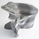
When I walked in, immediately I noticed what looked like chairs made of material that did not look comfortable to sit in. Chairs were constructed from black steel, stainless steel, glass, and other metals. I was amazed at how these artists were able to change the normal conception of everyday objects into a new idea by stressing the physical appearance of the objects over its function by using industrial materials.
These two chairs are prime examples of expressive design (top: bone Lounge Chair, bottom: Slice Chair). The chairs are transformed into a new way of picturing chairs by taking on the opposite of a comfortable chair and giving it a stylish design using aluminum and polyurethane.
The next floor displayed figures expressing characteristics from the Decorative Design Movement. Art in this era encompassed subtle patterns and colors. I particularly enjoyed the Luigi 1 Chandelier which was a ceiling fan with a few light bulbs branching off. There was glass shaped into vines which wrapped around the fan. The work had vivid colors like bright yellow, red, and green. I also marveled at the Agaricon Lamp. It was semi-transparent and made of polycarbonate and aluminum. The shape was like a mushroom which I found unique. The top had a glittery tint and the battery and light bulb could be seen.
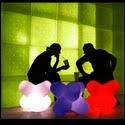
The top floor and personally my favorite of the entire exhibit featured art from the Neo-pop Movement. The objects gave a new perspective of everyday objects using bright colors and strong, prominent patterns. There were a set of 3 humongous jacks that lit up. There was a blue, red and white one. The artist took the jacks out of its normal setting, enlarged them, and put a twist to them by making them glow. I remember reading the label for this particular artwork and it suggested the jacks be used for sitting on, stacking, or for lighting. Never would I have imagined using the jacks in all of those manners. This goes to support Ways of Seeing again because Berger said, “It is hard to define exactly how the words have changed the image but undoubtedly they have.” Reading the label has altered how I think of the art now because it is not only for viewing purposes but for everyday functions as well.
Subscribe to:
Posts (Atom)


